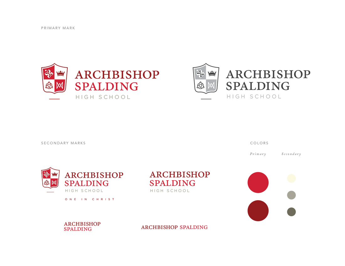
Logo Option 02
The second logo utilizes the updated shield as the primary artwork. A strong, bold serif typeface
was chosen to balance the line-weights of the mark. A secondary typeface was used for High School
to help modernize the mark, and diversify the brand standards. Two reds are again used to focus
attention on 'Spalding', as well as differentiate items in the shield. Secondary marks show options
using the tagline, without additional artwork and two minimal options for small sizes.
Next