Shield / Crest Refresh
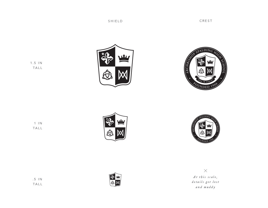
The shield was cleaned up by simplifying the shapes of each icon to allow for better readability
at small sizes. More solid areas, removal of stroked lines and redrawn areas allow for the shield
to work down to approximately 1/2 inch. Smaller than that, and the complexity is too deteriorated
to be recognizable. The crest is currently a work in progress. It uses the clean version of the shield,
but still has Garamond as the out typeface. Once a type-treament or new logo is chosen, the selected
font will be transitioned over to further brand consistency. As the crest begins to get small,
the tagline below the shield is unreadable and needs to be removed, allowing for the shield to get bigger.
Any smaller than that and shapes begin to bleed into one another and should not be used smaller than 1 in.
Next