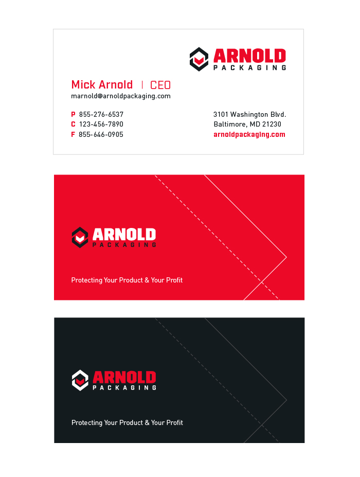
Option 1
Option one is sharp, well-organized and professional. The front of the card is a balance of a right-aligned logo and name/title to the left.
The email address is prominently displayed underneath the name. The web address is a bold red to prompt a client to visit the website.
The back of the card can be either a flood of red or black with the logo and tagline. The diagonal lines are an additional
detail which represents the die-lines and fold-lines of packaging. In addition, the height of the card is slightly
shorter than a standard card, making it more distinguished.
Next