Option 3
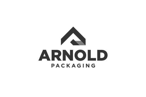
Clean, professional and precise. The mark was created to depict a flowing arrow pointing upwards; a nod to
Arnold's helping clients in increasing profitability through streamlining the flow of internal systems. The mark can also be seen as "folding"
a subtle nod to packaging itself. The typefaces are Gotham Black for "Arnold" and Gotham Bold for "Packaging." They are
clean and timeless.
Next