
| Many companies with global capabilities often take
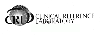
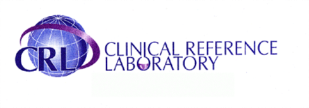
the literal approach. In this case the CRL logo uses a globe to represent
its “global” abilities. Often times, less is more. A properly
design, well balanced, two color corporate logo can work to say the
same thing through a more scalable, meaningful design. In this case,
we see many attributes competing for attention. Namely, the globe,
swoosh and flask are actually working against each other. Furthermore,
the design does not lend itself well to a traditional, two color (black
and white) format. At the very core, a good logo is designed first
in black and white in order to make effective use of positive and
negative space. This increases scalability through the effective use
of logo in all formats; fax, color printing, black and white printing,
web, etc. The next page will illustrate how some of the world’s largest, global companies became such marketable, recognizable brands through the use of clean, simple, yet meaningful logos. |
Next