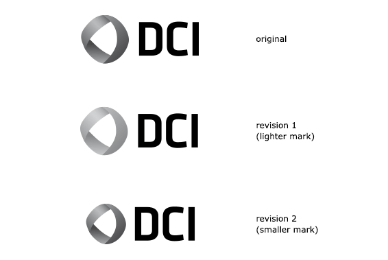
Revisions
The mark in this arrangement is based on a mobius strip, suggesting continuous movement and travel,
as well as the multifaceted nature of DCI's projects. It's paired with contemporary
typography that echoes its shapes.
The version at the top is the original version. In the middle, we've lightened the mark to show
what it might look like with a lighter color, to adjust the visual balance more toward the letters.
On the bottom, we've adjusted that balance instead by reducing the mark in size.