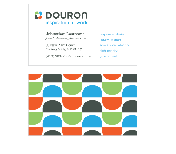
Option 3
This concept moves all the information onto the front of the card: logo, tagline,
services, and contact information. The typeface used on the card
is a modern slab-serif designed to complement the typography in the logo and tagline.
With all the information on the front, the back of the card becomes a stage
for an auspicious, colorful pattern created from pieces of the Douron mark.
Bright patterns position Douron as modern, competent company with an eye for design.
Back