Option 04
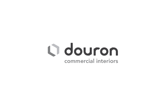
This mark is based on the geometries of a hexagon. The opposing arrows subtly define a space
within the two shapes. The logo mirrors the way Douron is able to constantly define empty,
functionless spaces by populating them with furniture, high-density shelving, or whatever
materials are appropriate to the environment. The logotype embodies the multi-faceted, unified nature
of Douron. Constructed from a limited set of parts, specifically circles, the typeface has a cohesiveness
and uniformity that is slightly-offset by angled notches in the letters, derived from angles in the mark.
Next