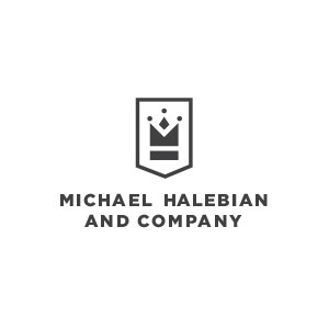

Logo Option 05
This mark leverages the M and the H in the company name to create a crown as a logo mark. The crown is a symbol representing
the strength, knowledge and confidence that Halebian brings. More specifically, the icon is constructed by combining the letterforms of a
capital 'M' and 'H.' The result is a one-of-a-kind mark. The animation on the right shows how we designed this mark. The
encapsulating shape is reminiscent of a heraldic banner and infuses the mark with history and experience. The symbol is paired
with a contemporary sans serif typeface that reinforces the implied letterforms of 'M' and 'H' without distracting from the mark.
Together, they establish a visual hierarchy and stately balance.
Next