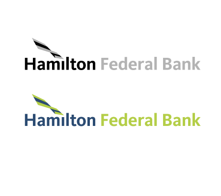
Option 6
Using another typeface designed within the last decade, this time in a bolder fashion. We see a very warm, friendly and
approachable company name, but the presence of the name is more primary in this logo (compared to option 4). The mark,
designed to embody a flag, is shown marking the dot on the "i" in "Hamilton." The flag is sweeping upwards in an effort to connote
the bank's forward-thinking strategy and ability to help its customers grow along with the bank. The three bands in the flag
represent the bank, its customers, its services and the close relationship between the three.
View All