Option 4
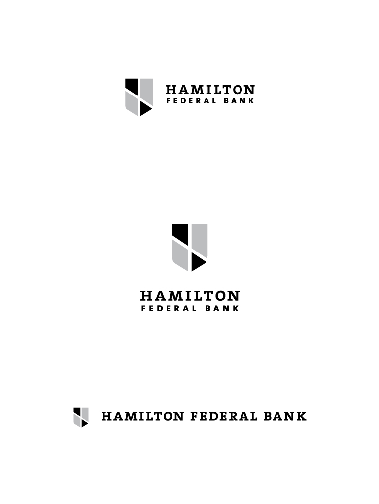
This mark is derived from geometries found in the Baltimore and Maryland flags, instilling in the logo a sense
of pride in the community that Hamilton Federal Bank already works so well to embody. The pattern is framed
in the shape of a shield—also a symbol found in the Baltimore City flag—which symbolizes permanence and trust.
The fonts used are bold and solid; metaphors for a strong, trustworthy and firm foundation.
Next