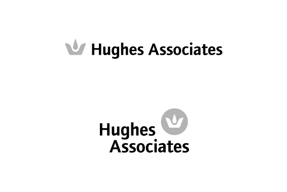
Option 03
This logo is shown in two arrangements: linear and stacked. It could be used either way,
given the space it needed to appear within. The mark represents many things; a crown, a flame,
a droplet of fire retardant, and a nautical anchor. The nautical anchor aspect of the mark
is a subtle nod to Hughes' past. The crown aspect of the mark works to underscore the
firm's market position as a global leader. The mark is paired with a modern sans-serif typeface.
Intricacies in the type compliment the unique geometries found in the logo. The result is a timeless,
confident brand that communicates the firm's multiple facets and over-all positioning as an industry luminary.
Next