3. Precise but Relaxed; Brand-Centric
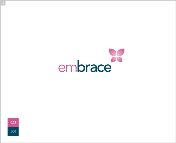
The most striking aspect of this identity is the mark; an abstraction that resembles a butterfly,
or secondarily, a flower; embodying lightness, softness, and freedom. The implied intersection of the
forms also echo the form seen in the IZI identity. Both the font and the blue color in this logo were
pulled directly from the IZI identity. The overall effect is a balanced composition that feels poised and
relaxed with elements that pay homage to the parent brand.
Prev | Next