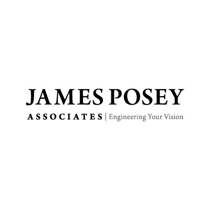
5c. Powerful, Strong, and Tenured.
This logo uses type only to convey the primary name of the firm
as the firm is commonly referred to in the market place. This is
accomplished by minimizing the name “Associates” which also results
in a logo that will work well (with or without tagline) in the
title block area of James Poseys plans. The logo uses all capital
letters to convey a powerful, strong and tenured firm (this logo
concept would fall apart using lower case lettering as its prowess
and balance almost completely diminish without uppercase lettering.
Previous | Next