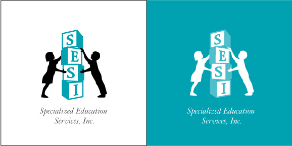
Homage to the Original Logo
This option stacks blocks much in the same position the "1" in Kids 1 used to appear. The children are seen in a similar position as well. The blocks instantly connote that the letters in the name S-E-S-I are meant to read as an acronym, not a complete word. The children's arms and hands have been cleaned up so that they are symmetrical. The type has been updated to portray a more refined, traditional look indicative of a schooling system.