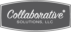
An enclosed version of logo #4. The round sided container shown here works to create a never-before-seen branded look within CS's space. Secondary purposes of the box include the illusion of the company name / logo appearing to grow exponentially - results clients will experience working hand in hand with CS.
Forward thinking, fresh and set far apart from the pack. This logo makes use of unique and memorable typography that is written out in a script fashion. The use of script works to outline "connectivity and collaboration"(working jointly to accomplish a singular goal). The asterisk works both as a punch, or accent, and also as a Spark! that serves to embody the jumpstart CS provides its clients. The type used for the word "solutions" serves to ground the script-based type above it in an effort to create a polished final logo that portrays a grown up professional company.