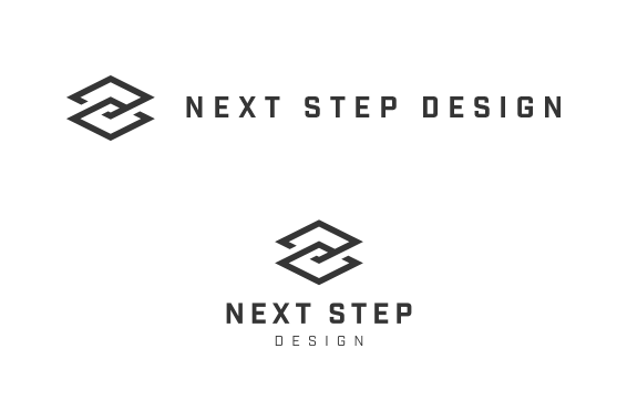
Option 3
This mark was inspired by the isometric view of restaurant building plans. It's openings are a nod to
the "flow" NSD brings to
their final concepts. The shape seen in the mark also creates the perception of
an elevated square, emphasizing
NSD's "higher" quality final deliverable. The mark could also be seen as
a subtle nob to stacked, carefully spec'ed restaurant equipment. The typeface used here is Industry.
It is both angular and rounded, brining a technical personality to the table,
fitting attributes for NSD.
Next