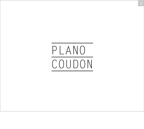
2. Minimal, Modern, Streamlined
This type treatment has literally been "constructed." The individual letters each
occupy the same width and height. They perfectly line up with their counterparts, effectively representing
blocks or bricks. Each name occupies its own level, and together, the letters and lines represent
the very nature of Plano-Coudon's respective industry: construction. The attention to detail
demonstrated in this logo is representative of the professional, focused, engineer's
approach indicative of the Plano-Coudon team.
Typeface used: Letter Gothic
Previous |
Next