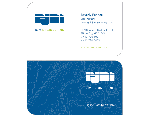
Option 3
The shape of this card is derived from the geometries already present in the RJM logo,
creating a harmony among all of the elements in the design. The design makes use of the existing
brand colors and topographic pattern. The pattern appears on the reverse side and would be
emphasized by being printed in a slightly lighter blue than the background, then accented with
a spot varnish to add dimension create a tactile experience for the recipient. The logo and
tagline live on the reverse side as well. The thinking here is this card would be
digitally printed to avoid ink rub-off.
Back