|
Straying
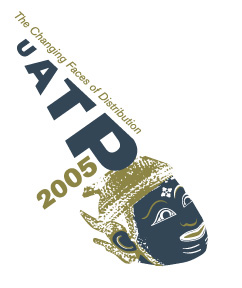
from the “water-color” effect that logo option 1 utilizes,
this logo provides a more creative, existential approach
to branding the conference. The type, was carefully designed and positioned
in order
to resemble that of ethnic Tai wardrobe. The illustration
of the Tai mask plays off a “stamped” technique and works
to draw the audience’s attention through its compelling facial
features. If selected, a secondary, more noticeable type treatment for
the conference’s
name and theme might be explored so that this logo would
still clearly convey the conference’s title when used in a smaller
format.
|
