|
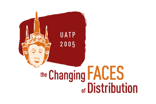
This logo concept was inspired directly by Tai Architecture
and ethnic wardrobe.Through research using Bangkok.com as
well as other web resources, Vitamin created a custom-illustrated
mark that blurs the lines between spires
used in Tai masks and spires used in Tai buildings. “The Changing
Faces of Distribution” theme is depicted in the mark by three
faces – one centered, and one on each side of the centered face.
The “cultural feel” created is juxtaposed through the use
of a cleaner type treatment that helps demonstrate modern Bangkok
as well as UATP's progressive nature.
The red/orange color palate reflects
cultural aspects of the area and creates a warm, contemporary
palate intended to make attendees feel “invited.”
Next
|
