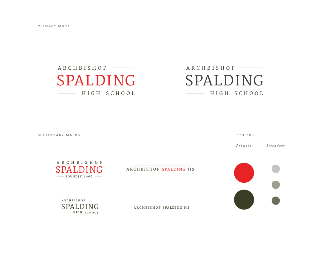
Logo Option 05
Working into a versatile shape, this logo focus heavily on the name recognition of Spalding.
A bright, energetic red was chosen to add life to logo, and pairs with warm earth tones, rather than
the current tan color scheme, to add richness and sophistication. Secondary treatments introduces
simplified versions with the founding years, a horizontal treatment and one-color options that will work at smaller scale.
Next