Fresh, innovative and creative.
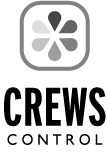
With the goal of creating a non-traditional layout that would speak to creatives and corporate prospects alike, this logo works to define who/what Crews Control works with by gently breaking up the name. The word CREWS is primary and the word CONTROL is secondary. This hierarchy works to break away from the automotive reference one can so easily confuse. Instead, the hierarchy in type works to create a firm and bold statement alluding to “crews being controlled.”
The combination of varying san serif typefaces provides a vertical, upward-moving and proud mark while the creating a feeling of expansion, growth and innovation. Overall, this logotype and mark is slightly more modern. It connotes that Crews Control a contemporary, forward thinking company yet one with a history and stable business platform.
