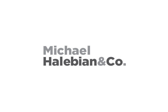
Logo Option 03
This wordmark was chosen on the character and personality of the typeface. It is hard-working,
timeless, and speaks with authority while also remaining approachable and friendly. With the spaces removed,
the lockup is a cohesive unit symbolizing the strength of the Halebian team. The name also
uses a squared off period to subtlety hint at materials and pieces of substrate, which could become
a versatile design element throughout the brand.
Next