Logo Option 04
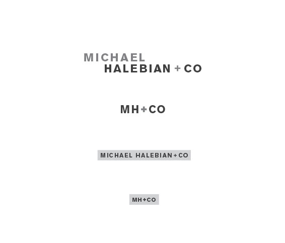
This mark uses a classic, geometric sans serif and is strategically constructed to be dynamic but still have structure
and balance. Changes in tone highlight key words and the alignment of the 'E' in the two stacked words
unify the design. The use of the '+' in place of 'and' symbolizes the "added" value of building
lasting relationships with Halebian staff. This option also comes with evolutions of the mark and
illustrates reconfigurations of core pieces for various sizes and formats.
Next