Option 5
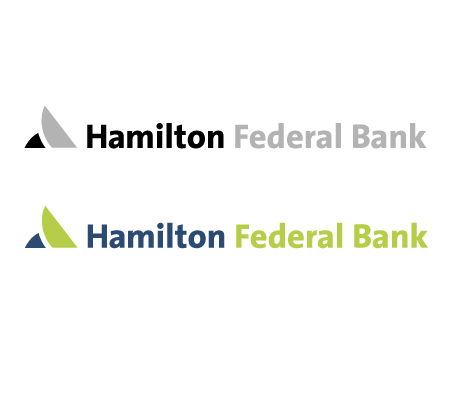
This typeface epitomizes a helpful and friendly company; attributes that represent the bank's strong customer service and desire to please
the customer. The mark is an abstract figure that was created to provide the bank with a branding element that is scalable and timeless.
It represents the duality of the bank from a business / personal banking standpoint. The mark is not meant to be literal; it could be
interpreted as an arrow, a wing, a monument, a sail; its purpose is to create movement in the logo in order to depict a fluid entity
that is grounded, poised and able to act quickly to meet client demand. We would like people to look at this mark
and determine for themselves what it means to them. It would be strong on a web site and strong on outdoor signage.
Next