Option 3
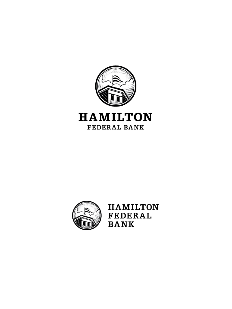
The drawing that is the centerpiece of this logo is a rendering that depicts Hamilton Federal Bank's
very first location - Harford Road. The artwork has been stylized in a manner resembling the line work that is
a hallmark of the engravings found on paper currency. The font used here is a distinctly modern serif that retains
a classic feel, keeping the overall look current while imbuing the design with a sense of history and permanence.
Next