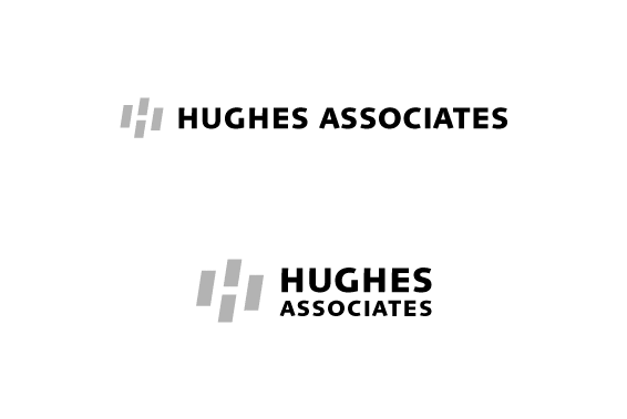
Logo Option 01
This logo is shown in two arrangements: linear and stacked. It could be used either way,
given the space it needed to appear within. The mark itself is dynamic, in motion,
and designed to represent mechanical systems and forward movement. It's shape was loosely
patterned after the way a flame flickers right to left. The typography is
modern, streamlined, and stable, balancing the dynamic movement in the mark. This overall
design is distilled, effective, and will remain scalable no matter what direction Hughes' business evolves.
Next