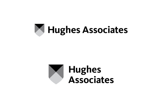
Option 02
This logo is shown in two arrangements: linear and stacked. It could be used either way,
given the space it needed to appear within. The mark is a faceted shield communicating
protection and strength. The shield is rendered in a simple, forward-thinking fashion.
Paired with a modern and clean type, this logo portrays Hughes as a contemporary entity.
The various facets within the shield represent the multidisciplinary aspect of
the company without being too specific or heavy-handed. This was done intentionally as a way
of retaining the mark's relevance even as Hughes Associates grows and evolves.
Next