2. Fixed, Bold, and Strong.
This identity was designed to portray NIKA as an established, design savvy, and forward thinking presence.
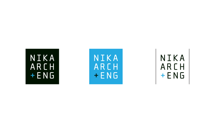
The containing form represents NIKA's holistic service offering. The precision seen in the type lock-up is
a nod to the precise craft of architecture and engineering.
Previous | Next