3. Precise, Clean, Simple.
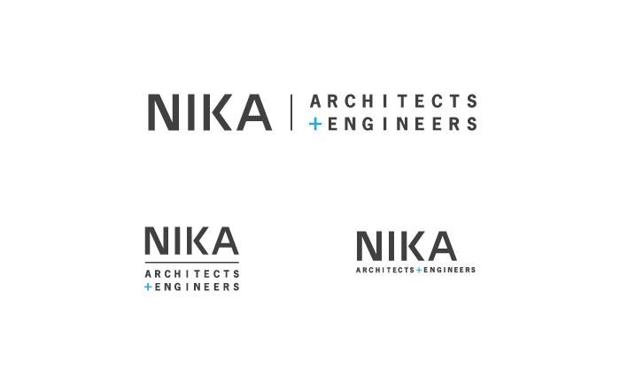
The type in this identity system is presented in a very direct manner, with very little embellishment.
The type in "NIKA" is hand-drawn to maximize the similarities between each of the letter forms, giving the
type a more unified look. This unified look embodies the cohesion that exists in the complement of NIKA's
design services.
Previous | Next