4. Professional, Refined, and Strong.
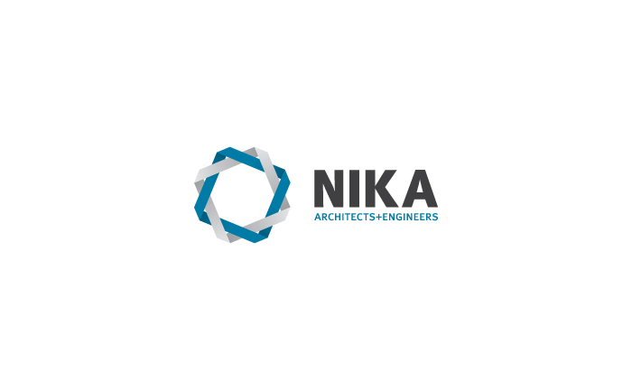
This mark makes use of subtle gradients to create a woven look. The woven look represents NIKA's seamless
integration of services. The multiple colors represent the two sides of NIKA: architecture and engineering.
The intertwined nature of the mark also represents a constant cycle of refinement and evolution of services.
The type depicts a bold, solid, trustworthy company.
Previous | Next