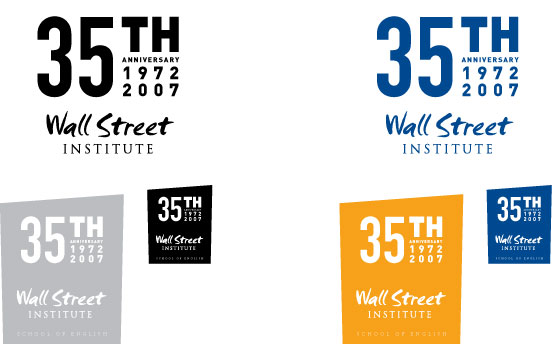
Upward moving and strong. Through powerful representation of typography, this mark demonstrates the unity and strength WSI brings to its clientele. Designed to work within a rectilinear shape, similar to the WSI square concept, the purpose here was to create a mark that would marry the existing logo and the anniversary mark. This marks acts as a “container” while also illustrating the growth of WSI (from past to present and from present to future).