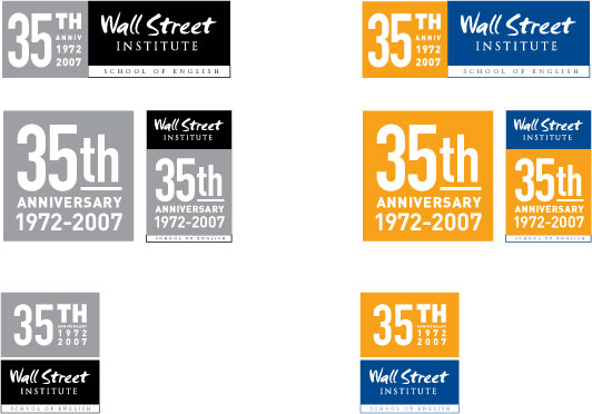
A variation on layout based on type option #1. This option was created for the purpose of marrying the WSI and anniversary marks together, while pairing new and different shapes. Utilizing the complimentary colors blue and orange, this mark really stands out. Here also, we see the strength rectilinear shapes being leverages. This series was designed as more of a compliment, or add-on structure, to the already existing WSI logo.